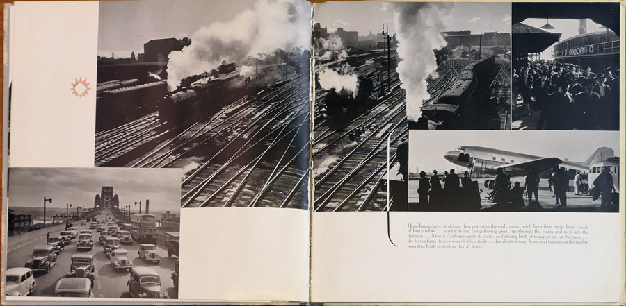
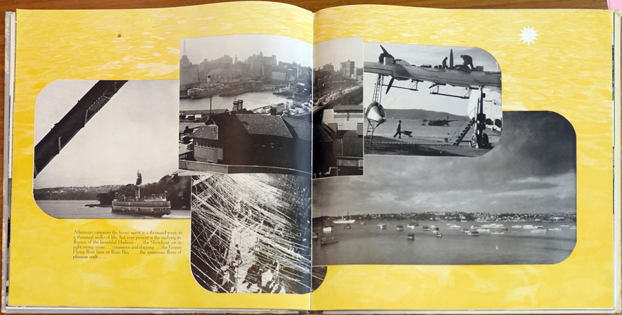
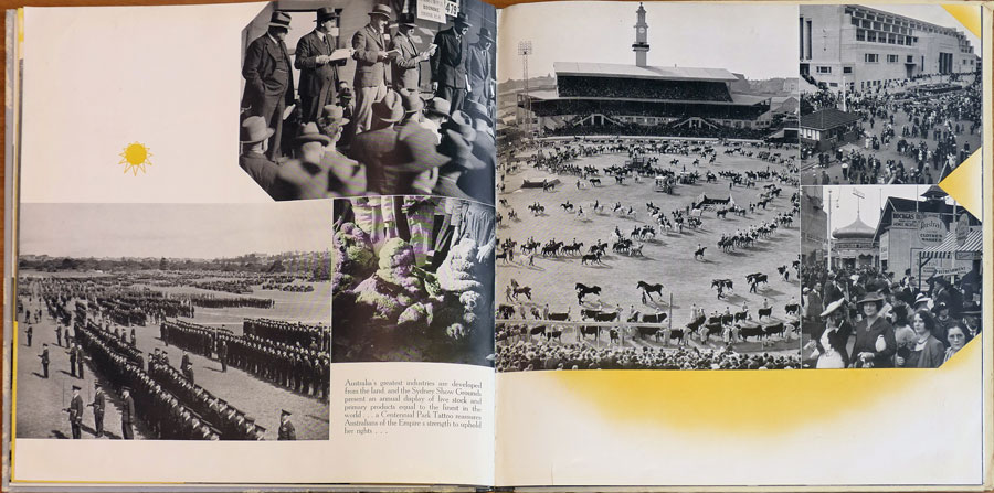
Sydney became an important base for Ziegler after he had arrived in the city in the late thirties. Sydney’s original role was as the centre of Ziegler’s sesquicentennial work, particularly Greetings From The City of Sydney, Australia. 1788-1938.
Once the celebratory commissions had been fulfilled, Ziegler under the guidance of the City Council, commissioned Max Dupain to compile a photographic record of life in Sydney. Up to this time Dupain’s work had been financed by advertising, his creative work featuring in Sydney Ure Smith’s journals The Home and Art in Australia. This commission for Ziegler was to be his first book. The photographs were incorporated into a design concept by Douglas Annand, a successful graphic designer.
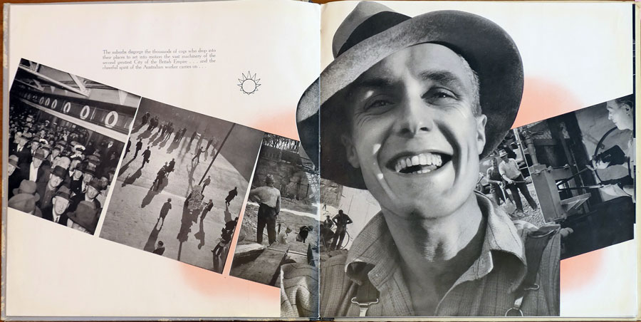
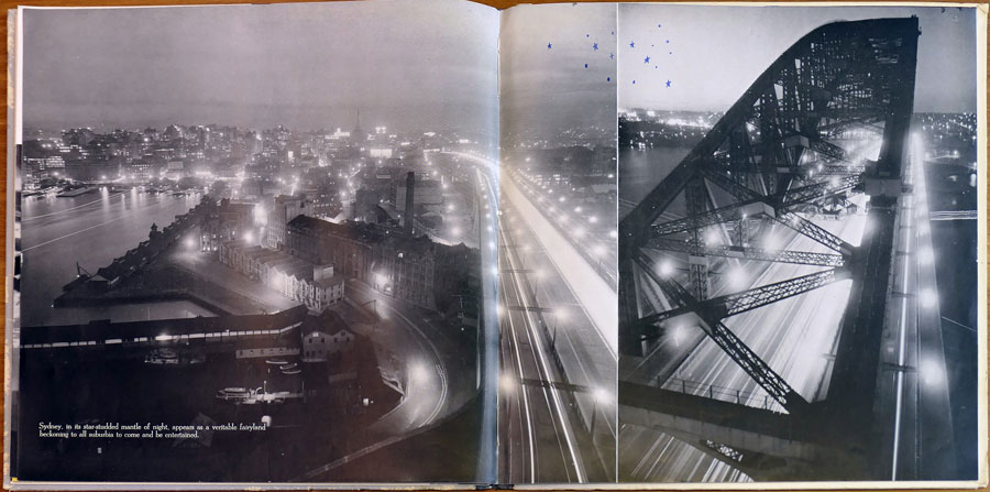
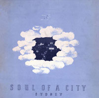
The resulting book was the first edition of Soul of a City, published in 1940. Annand had divided the photographs into times of the day and the various activities associated with these times. The times were indicated by a sunray motif shown in varying stylised stages of brightness. The people of Sydney were the subject of the book, the image content is devoted to lifestyle. Recently Dupain recalled that most of the photographs taken to fulfil the commission were taken at the weekend, hence the many images of recreation.13
Although three more editions were to follow, it is the first edition that has attracted most of the critical and historical discourse. Ann Stephen discusses it in her article ‘Mass-Reproduced Photography in the Inter-War Years’, as an example of the lack of involvement that photographers of the time had in the use of their work. 14
A problem that does emerge from all four editions of Soul of a City is the bias towards subjects within the municipal boundaries of the City of Sydney. While it is fair to say that it was, after all, the council who had commissioned the books in the first place, the absence of Sydney’s suburbia in a study of the city’s lifestyle is noticeable. Only tourist landmarks and sporting fixtures, such as beaches and racecourses, represent the Greater City.
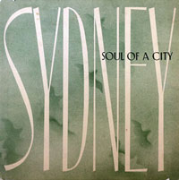
The second edition of Soul of a City, circa 1949, adopted a more relaxed layout. Dupain’s images are supplemented by work from Hal. Missingham and Associated Newspapers Limited. Gert Sellheim, long-time designer for Ziegler, worked on the layout. The second edition features a brief narrative on Sydney by regular Ziegler contributor, Eve Keane.
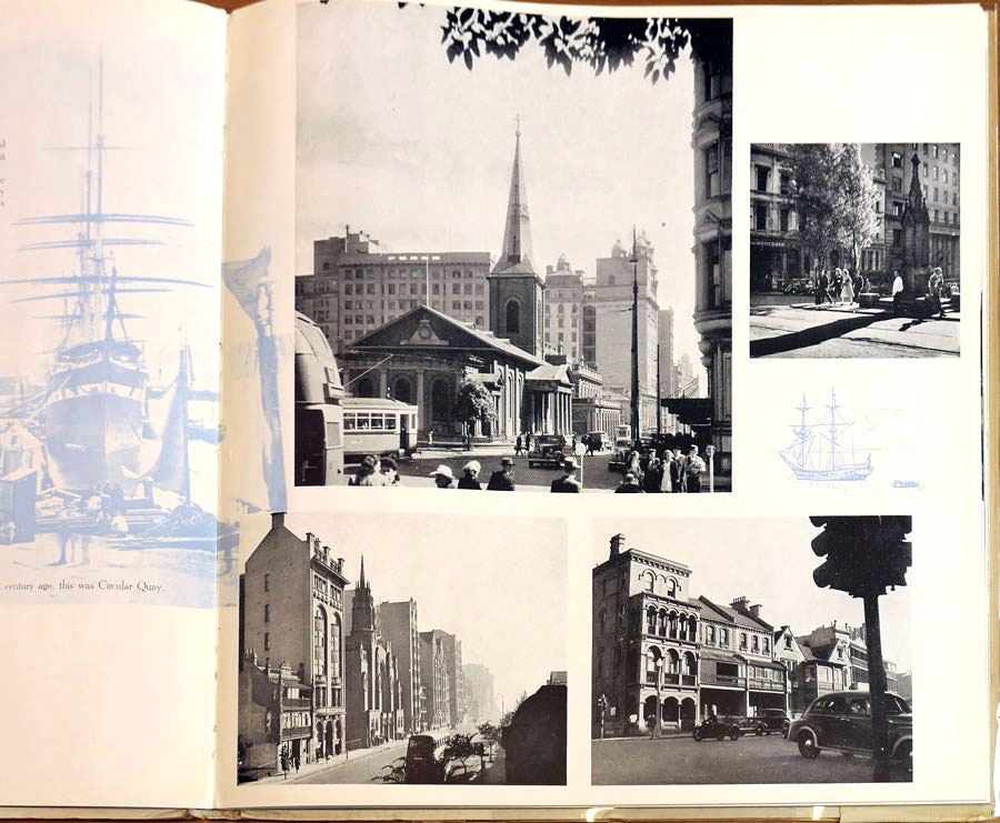
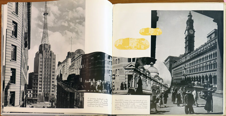
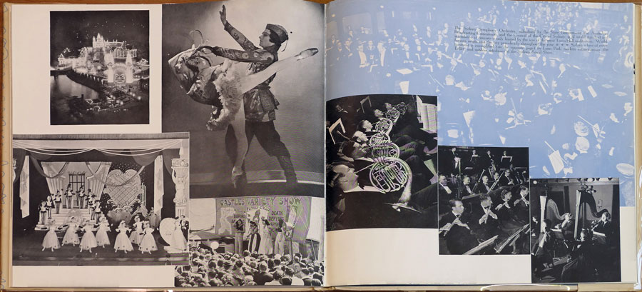
The passage of a day theme of the original edition is replaced by a historical order, the older buildings are complemented by backdrops of early painting printed in a muted blue.15 Views of modern Sydney follow, then several pages of lifestyle images follow. The busy workers of the 1940 edition are less apparent than sportspeople and picnickers.
Like its contemporary, Portrait of Sydney by the Ure Smith Group, the second edition of Soul of a City relies heavily on rather dated photographs.16 The AWA Building, completed in 1939, is absent from a photograph of Wynyard Square, the General Post Office Clock, removed between 1943 and 1963, is seen in several images and other contemporary changes to Sydney are conspicuous by their absence.17 By 1953 this was no longer the situation.
The third edition followed the second Soul of a City by only a few years. In this edition, while the photography is more recent, the importance of photography to the series is largely played down. Dupain, although obviously the principal photographer, receives no credit. Sellheim, the designer, and some of the artists who had painted the colonial era images featured in the book are the only visual contributors to the 1953 Soul of a City credited with their work.18
Sellheim’s design is in an olive green theme and the layout is a little more dynamic than the laidback patches of blue from 1951. As the presence of the colonial painters suggests, Soul of a City’s 1953 incarnation is the most visually historic of the series. The end papers carry a stanza from a poem by John Thompson, an expanded version of which appears in the final (1962) version of Soul of a City.
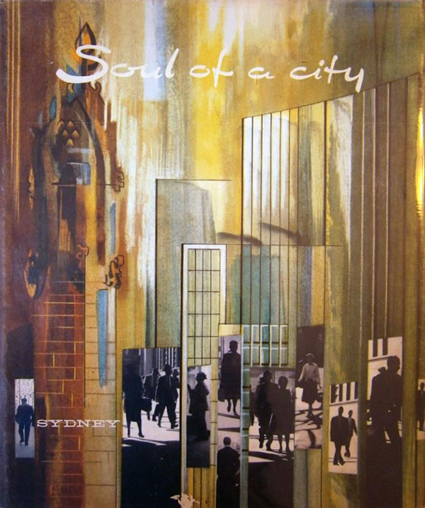
After the two rather muted fifties era versions, the 1962 edition returns to the exciting human activity of the first. Max Dupain’s work is supplemented by images by Australian Consolidated Press, Douglass Baglin, Noel Hickey, Ivan Ive, D. Schumancher and the Sydney Morning Herald. Oswald Ziegler is credited with the conception. The end papers and cover are by Joseph Stanislaus Ostoja-Kotkowski F.R.S.A.19, the cover incorporating examples of Dupain’s work from all four editions.
Part of the excitement in the fourth edition comes, not from the people, but from the massive changes that were sweeping over Sydney’s skyline. The historical factor that Soul of a City presents in 1962 is the strong presence of the 1960s context in which Sydney’s aging history had found itself. There is a suggestion that the book covers the changing times of day, not as explicitly as the 1940 edition. The night images in the 1962 edition are placed nearer the centre of the collection rather than the end. Nightlife in 1962 Sydney had an appeal to youth that isn’t recorded in the early forties.
A major influence on the layout of the fourth edition was the catalogue for Edward Steichen’s Family of Man.20 Ziegler’s Australian Photography 1957 had already reflected the influence of Steichen’s catalogue on photographic layout. While the previous editions had already followed themes for each double-page spread, the 1962 edition captions these with quotations. The quotations are from John Thompson’s poem as expanded from the 1953 endpapers.
For example, the trio of photographs representing Sydney’s sporting pursuits features this quote,
And tens and tens of thousands above all else esteem
Some small totemic Ball and some high totemic horse.
The photographs represent three typical Sydney spectator sports. The top left image is taken at a cricket match. The game is shown in progress as one of the batsmen is being caught out. There are six figures, the two batsmen, two fielders, a wicket keeper and the umpire. The reaction of the figures to the fielder’s successful leap is as important to the image as the leap itself.
Below this is a photograph of the White City tennis court where a Davis Cup Match between Australia and the United States is about to begin. Opposed to the climactic cricket photograph, the tennis image is tense. The opening serve is about to take place and all eyes are on the ball. The background composition of the massive stadium looming above the nearby terrace houses testifies to the event’s importance in Sydney’s lifestyle.
The final image, to the right of these, is the most intensely active. It shows a horserace in progress. Taken from ground level only feet from the leading horse, the flying sods of turf and raised whips are more violent than anything seen in the other laid-back summer sports.
The link between the verse and the images borrows from Family of Man insofar as Steichen’s use of literary and proverb quotes in captioning the exhibition’s images. Admittedly Thompson’s poem appears to have been written with Soul of a City’s pictorial content in mind but the final result is similar. The poetic stanzas are outnumbered by direct captions, unlike Family of Man.
The story of Soul of a City would not be complete without reference to its successor, This is Sydney. First published for the Council of the City of Sydney for Christmas 1974, it was reprinted in February 1975 for the Lions Club Cancer Treatment Fund and again, slightly revised, for the general public in August 1976. Using some of Dupain’s 1962 studies of the Town Hall, This is Sydney featured the work of many photographers, notable Bruce Hamilton and John Carnemolla.
This is Sydney does not follow the unified photo-essay pattern of Soul of a City, it relies as much on text as it does on photography. Except for Dupain’s Town Hall studies, the photographs are in colour. There is more emphasis on the physical development of Sydney, the cultural aspect which was central to Soul of a City is linked wherever possible to the Council’s ideal Sydney of the future. The architects’ visions of council related projects reflect the trend towards pedestrian plazas that had replaced the grand redevelopments stifled by Green Bans and public interest in the preservation of Sydney’s history.
The style of Soul of a City was dependant on the uniformity of the principal photographer’s intentions. Max Dupain’s collection of photographs are classic studies of his home city and images from all four editions appear in his 1986 anthology, Max Dupain’s Australia.21 The more active 1940 and 1962 editions are probably the most interesting but the entire series was influential on the photographic presentation of Sydney.
|
#12: An example of the layout of the 1940 Soul of a City. Reproduced from Art Network, Number 9, Autumn 1983, p. 44.
Collection of the Power Research library, university of Sydney. |
| |
|
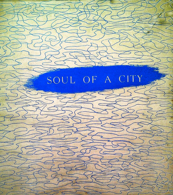
| #13: The dust jacket from the second edition of Soul of a City, designed by Gert Sellheim, c. 1951. |
| |
|
| #14: A double-paged spread from the second Soul of a City, with a Sellheim sketch of an old building, a patch of sky and a colonial-era painting reproduced in blue as background to the main images. The third image from the left shows Wynyard Square without the A.W.A. Tower despite the building being at least a decade old when this edition was released. The tower should be above the words ‘shady trees’ in the caption |
| |
|
|
| #15: The dust jacket of the 1962 edition of Soul of a City, designed by Stan Ostoja-Kotkowski using Max Dupain’s images from all four editions of Soul of a City. |
| |
|
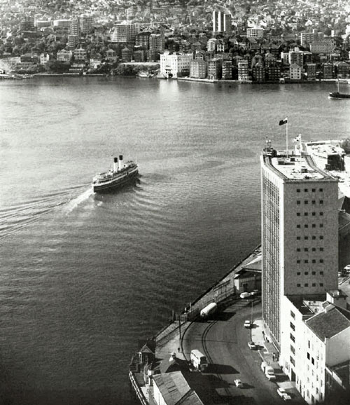
| #16: The 1962 edition of Soul of a City did not contain any early paintings of Sydney. This photograph, however, is reminiscent of Charles Conder’s Departure of the S.S. Orient, 1888, collection of the Art Gallery of New South Wales |
| |
|
#17: Youth and nightlife in Soul of a City, 1962. ‘In sunlight spatter the neons wink…
Nightfall is known of by a creeping of the skin’ from John Thompson’s poem, used in this edition for some captions. |
| |
|
|
| #18: Sport in the 1962 Soul of a City. |
| |
|
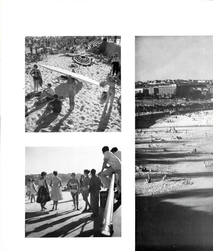
| #19: Bondi Beach in the 1962 Soul of a City. |
| |
| |
| |
Below are links to the four editions of Soul Of A City (Sydney).
Canberra A.C.T. was published in 1961. At the time the National Capital Development Commission (N.C.D.C.) was finding its feet.
During the early twenties the Government was divided over the adoption of Walter Burley Griffin’s basic plan for the City of Canberra. Parliament had settled in Melbourne and the chance that the public sector would have to move deep into the New South Welsh countryside was unwelcome in many parliamentary circles.
When Canberra officially became the nation capital from 1927, Griffin’s architectural legacy was minimal. The original buildings were uniformly influenced by Mediterranean-style architecture which was, particularly in Sydney, influenced by both studious architects like Leslie Wilkinson and envy of Hollywood movie stars’ mansions.22 As Canberra grew, changing trends in architecture resulted in a variegated city, unlike Griffin’s unified monument.
In 1960 Robin Boyd’s The Australian Ugliness had summarised the philosophies of the intellectual urban planners of the time. Boyd argued that the rapid development of Australia’s cities and the need Australians felt to assimilate with overseas cultures, particularly those of the United Kingdom and the United States, had resulted in vulgar aesthetic values. Canberra was no exception, as Boyd wrote of its post-war development,
…new suburbs grew almost as undisciplined as in any other Australian City. Canberra reached its nadir about 1954. A rule which required roads to be made before houses were constructed was about all that remained of the early idealism. The centre was still dry and empty, Parliament House was still the “provisional” 1927 building next door to the permanent site, and as ill assorted a group of offices, banks and commercial buildings as ever were built – blue tiles, bacon-striped stone, yellow porcelain, concrete grilles, aluminium – began to disgrace the once sleepy Civic Centre. There were no effective building regulations. The airport reception building was a wooden shed. 23
After forty years of indecision Canberra’s permanence was finally assured in 1955. A planning re-think was undertaken that year which resulted in the formation of the N.C.D.C. in 1958. Canberra was to be developed as the centre of Australian Government – more than just a seat of Parliament and a home for its associated staff – and plans to house sixteen-hundred Defence and Service Departments’ staff and families in Canberra were underway by January 1959.24
Canberra was leaving it very late to run for a share of the post-war immigrants but if it was to house a population of 100,000 by 197425, the city needed to appeal to outsiders immediately. Equally important was the tourist industry, already attracting 300,000 visitors annually.26 In the mid-fifties Canberra housed Australia’s first Motel.
The need had arisen to produce a book about modern Canberra that was neither an official report nor a small, glib yet throwaway brochure extolling the virtues of the N.C.D.C.. Oswald Ziegler Publications’ Canberra A.C.T. was the result.
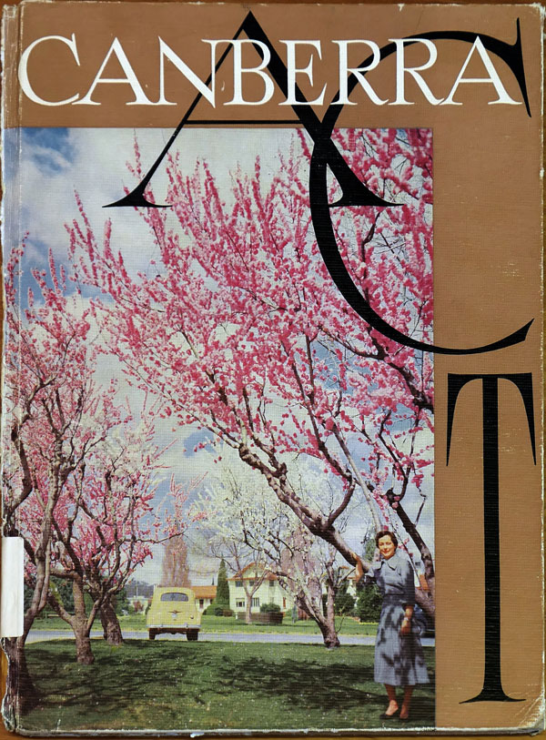
Most previous publications about the capital featured one of the city’s monuments or landmarks on the cover. Canberra A.C.T. conveys an alternative, very domestic approach for its cover image - although the photograph is posed opposite the Hotel Canberra.
Trees blossom in large open gardens, an austerely dressed woman leans against a tree at right and in the centre left an early model Holden faces away from the viewer, pointing to an autumnal poplar among hedgerow fenced residences.27 The Holden and a rather sparse Gum Tree are the only specifically Australian objects in the photograph. The age of the Holden and the apparent age of the photograph suggest that, despite the culturally ambiguous surrounds, Canberra is still part of established Australia.
The design of the cover features a band of dull brown which partly frames the photograph. CANBERRA is written efficiently in white across the top while the letters A, C and T are in intertwining black type. A.C.T. acts as a definition. The A.C.T was no longer a vague corner of New South Wales called the Federal Capital Territory. Canberra is presented as being important culturally and independent commercially within its own definable hinterland.
The endpapers carry a sketch titled Canberra Vision.
In 1961, with so little of the central triangle complete and Lake Burley Griffin being constructed, even the Canberra of 1963 could not be suggested in a contemporary photograph. An artist’s impression is the logical substitute, with the advantage of projecting the vision ahead to the then final plan for all central triangle landmarks.28
The texts follow, with Prime Minister Menzies defending expenditure on beautifying Canberra, particularly the Lake project, and a more thorough text by Roger Rea recounting the city’s history and lifestyle. “Life is always what people make it…”, he concludes, “and it is fair to say that the Canberra dweller is a happy one (citizen).” The illustrations represent “some of the contributions (a Canberran) makes, not only to his fellow citizens of Australia but, in not a few fields, to the people of the world.”
When commissioned to work on Canberra A.C.T., David Moore was an experienced photo-journalist recently returned from a lengthy residency in London.29 Canberra A.C.T. was the second of three Ziegler publications that Moore worked on. It is also his only credit as a principal photographer for Ziegler.30
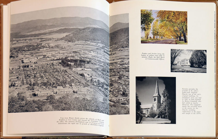
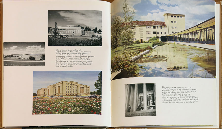
The first group of photographs concentrate loosely on the monumental architecture of Canberra. Education and religion precede politics. Parliament House does not appear until nine pages into the illustrated section, after the major schools and churches. The subsequent topics are scenery, recreation and commerce. The final page is devoted to the future in the form of a model and another artist’s impression.
Canberra being a Garden City, every opportunity is taken to show the gardens around the buildings. The colour photographs favour autumn scenes, although all season are represented in colour. A very muted winter image is a highlight of these seasonal records. It was important to stress that the open areas the open areas in the city were gardens rather than wild growth, i.e. Canberra is a sophisticated, aesthetic capital, not a bush pretender.
The destruction of trees that Boyd defined as ‘arboreaphobia’ was discouraged more than in other Australian cities, as was the replacement of trees with telegraph poles and fences.
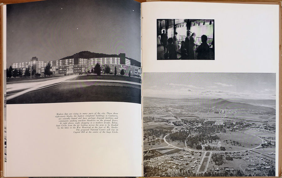
Even the black and white aerial photographs of the city avoid, as much as possible, any lack of order within the open spaces. Images of the city’s centre divert attention away from the absence of Lake Burley Griffin.
The people of Canberra are shown at work, at play and out shopping. The civic centre is the subject of several ground level studies, the next most important centre, Manuka, is only seen from the air. The Spanish-style buildings of Canberra’s early days are ignored in favour of the modern buildings. Contrary to Boyd’s criticism, the diversity of the Civic Centre’s post-war expansion was mimicked, not eschewed, by the N.C.D.C..31
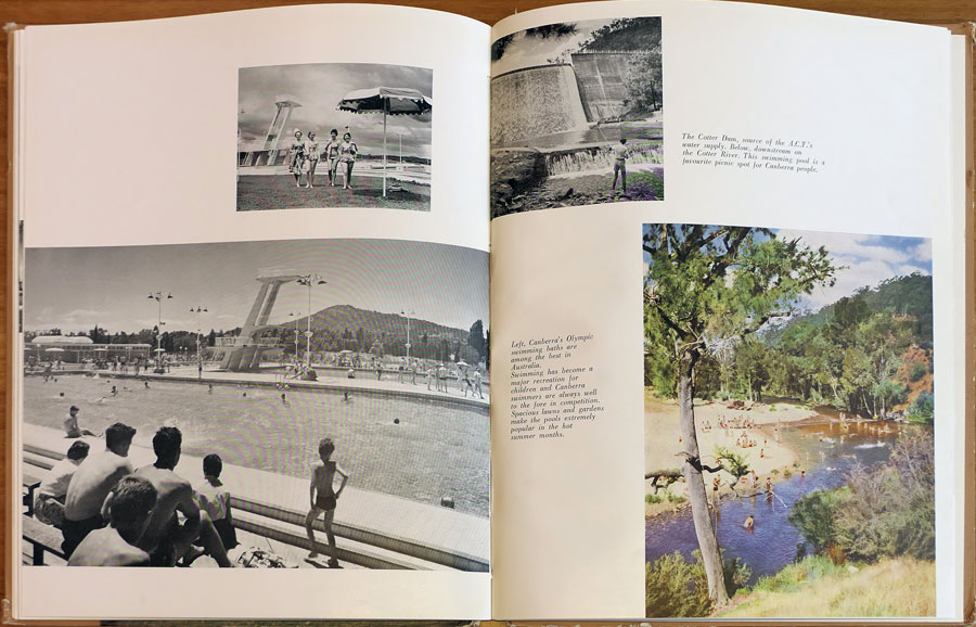
Recreation is shown as the pursuit of sport. This is not only linked to Australia’s reputation as a sporting nation but to the lack of facilities for the “nearly fifty associations… devoted to the arts, sciences and education.”32 outside the budding Australian National University. Depicting active recreation also helps to counter any trepidation a potential Canberran might feel towards living in a city so economically dependant on office work.
As with the prominence of the name A.C.T. on the book’s cover, the images inside suggest a definitive Australian Capital Territory within the borders with New South Wales. The reader is shown Mount Stromlo, ski slopes at Mount Franklin and activities in local farmlands. One is assured that “half an hour’s drive is enough to be in the delightful countryside.”33
While the photographs of Canberra are often active in detail or subtle in aesthetics, the buildings, particularly the commercial structures, often bear the appearance of models. The problem is not so much in the photography or architecture as in the incompleteness that marred Canberra for so long during its early history. This is especially true of the newer buildings where the gardens are full of seedlings and future neighbouring structures that, in established cities, act as the ‘black velvet’, the attractive backdrop to the architectural ‘gem’ remain unbuilt.34
It is a pity that histories of David Moore’s work do not mention Canberra A.C.T. as, despite its commercial intention, it is the first volume to credit him as the principal photographer.35 The challenge of the sparse architecture is met with a typical Moore middle distance approach to façade images. Too few images chosen display Moore’s talent at close range: of the images chosen the best include the public servants leaving the Administration Building and a group of late-night shoppers.
While no photograph carries the identification of its creator, the photographs provided by the Commonwealth News and Information Bureau would seem to be the aerial and sight-seeing style images. Moore’s images are probably the lifestyle and architectural photographs, those genres being a general strength of Moore’s oeuvre. The portrait of Menzies accompanying his foreword is the official portrait taken by Arthur Dickinson in the late 1940s.
In the past thirty years Canberra has grown out of the central district into several satellite regions. The move of Government Departments to the city is essentially complete and the current growth is commercially inspired. The National Library and Gallery occupy sites on the Lake Burley Griffin waterfront, other theatres, galleries and libraries have spread through the territory.
The final site for Parliament House was decided during the 1970s and the building completed by 1983. The Australian Institute of Sport is based in the northern satellite of Belconnen. The distant plans of Canberra A.C.T. are now part of the city’s history.
some of the original images in the pdf supplied were not suitable for this onlone version
we have substitued the closest available plus a few more - so the labels might not be quite accurate
| |
|
| #20:The front cover of Canberra A.C.T., 1961, showing the rather dated photograph. |
| |
|
| #21: Monuments and Shopping Centres, Canberra’s early sixties image. From Canberra A.C.T.. |
| |
Ziegler’s three Brisbane promotions published between 1947 and 1959 were not as specifically directed towards the photo-essay style of his Sydney and Canberra work. The first two, Brisbane, Queensland’s Capital of 1947 and Brisbane, City in the Sun of 1957 were rather short and were a collection of city landmarks punctuated by the occasional statistical graph of Brisbane’s industrial progress. Brisbane 1859-1959 was, at 695 pages, a massive tome devoted to the history of local government and the operations of the Council of the City of Brisbane.
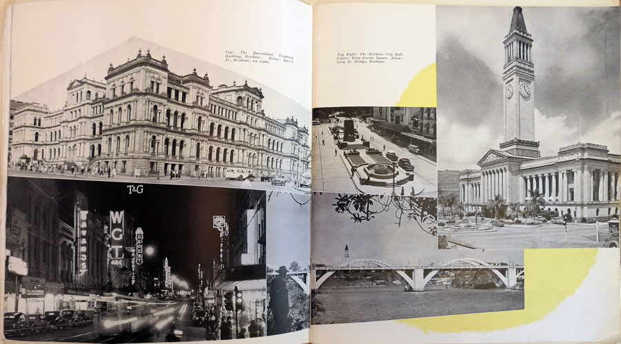
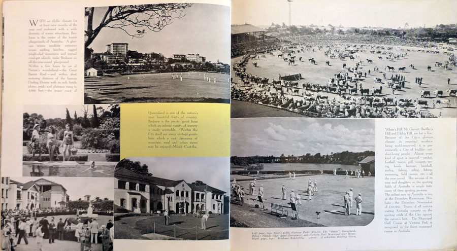
Brisbane, Queensland’s Capital is, despite being the shortest, the most profusely illustrated. Double-paged spreads of montaged photographs on a patchy yellow background are typical examples of Gert Sellheim’s style although there are no design or photographic credits. Like all regional councils, Brisbane’s concerns were to show a variety of landmarks alongside pages devoted to housing, education and recreation.
Use of aerial photography at the start of the illustrated section establishes the City Centre as not only the hub of an expansive city but as a shipping terminal. This is followed by several ground level views of the commercial centre with emphasis on the political buildings such as the City Hall and Government House. Then, in order, the book shows housing, major churches, hospitals, educational institutes, sporting fixtures, memorials and historic sites, parks, industrial developments and, finally, the airports.
While the book is a good record of Brisbane’s architecture, there is a noticeable lack of active, lifestyle photographs. Brisbane, City in the Sun does not differ greatly from that format, although a sunray motif replaces the yellow patches.
Brisbane 1859-1959 contains fewer photographs within its massive text, yet the selection contains the most interesting images. These are historical images, the city decorated for celebrations or the effects of floods and fires. The bulk of the photographic material is a pictorial history of important members of the council and notable council undertakings.
Compared with the humanity shown in Soul of a City and the domesticity apparent in Canberra A.C.T., Ziegler’s Brisbane promotions approach the potential settler / investor with a sense of sangfroid. The potential tourist trade is ignored as is the off-duty lifestyle of Brisbane residents.36 The council was so determined to promote their achievements that non-council activities barely deserve mention.
This bias is possibly the result of such a large population governed by the one council, unlike other cities which did not incorporate their municipalities into one greater city. Those that did, e.g. Newcastle and Wollongong in New South Wales, had industrial reputations which the councils tried to counter with tourism and cultural promotions; the opposite of tourist-centre-Brisbane’s approach.
Brisbane’s council, however, appreciated Ziegler’s work enough to reprint his first promotion in 1949, then commission a second followed by the major centennial history publication. The books are interesting if not triumphs of mid-century Australian photography.
some of the original images in the pdf supplied were not suitable for this online version
we have substitued the closest available plus a few more - so the labels might not be quite accurate
|
|
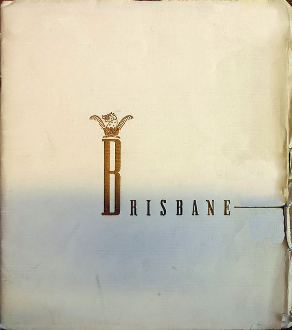
| #22: The title page from the 1949 reprint of Brisbane, Queensland’s Capital. |
Notes:
I. Soul of a City:
- Max Dupain interviewed by Peter Ross on ABC Television on September 9, 1990.
- Art Network, Number 9, Autumn 1983, pp 40-45.
- Sellheim favoured colour themes, particularly during the late forties and early fifties. The blue mentioned is an example.
- Some other discrepancies include Garden Island before the Captain Cook Graving Dock was built, (completed 1945) and camouflaged Government Buses. There seems to be a Holden in one image and the council boundaries are those of after December 1948. Since the Holden had been released in November of 1948, it is possible that the second Soul of a City dates from 1949, not 1951 as often stated in library catalogues.
- Gwen Morton Spencer, Sam Ure Smith, editors, Portrait of Sydney, Sydney, c. 1950.
- The 1953 version is also the only edition to bear a publication date. All other dates are from library catalogues or educated guesses.
- Joseph Stanislaus Ostoja-Kotkowski was a Polish-born Adelaide artist. His endpapers were later adapted for the 1976 edition of Ziegler’s This is Sydney. He also supplied several of the photographs used as title images in Ziegler’s Australia 1901-1976.
- op cit n.10, New York 1955.
- Melbourne, 1986.
II. Canberra
- B. N. Johnson, ‘Leslie Wilkinson and His Architecture’, Art and Australia, Volume 10, Number 1, Winter 1974, pp 53-71, and Maisy Stapleton, ‘Hollywood’s Influence on Sydney’. The Sydney Morning Herald, 27 January 1990, p 121.
- Robin Boyd, The Australian Ugliness, Melbourne, 1960, p 14.
- Robert Rea in the text for Canberra A.C.T.
- 1959 estimates quoted from N.C.D.C. Planning Report, February 28, 1961, p. 6.
- op cit n. 25., Sydney, 1961.
- The Holden is almost certainly the first model, the 48-215, built between 1948 and 1952. Although the F.J. (1953-1956) model had a similar body shape, the rear of the car was more ornate.
- Despite several alterations to the arrangement of the central triangle’s buildings, the area is now all but complete.
- Max Dupain, ‘David Moore, Photographer,’ Photofile, Volume 2, Number 2, Winter 1984, pp5-7., and Martyn Jolley, ‘David Moore, A Life,’ Photofile, Volume 7, Number 1, Autumn 1989, pp 5-7.
- The first Ziegler Publication to use Moore’s work was Orange 1860-1960, the third was Australia from the Dawn of Time to the Present Day, 1964.cover of the latter volume incorporated one of Moore’s photographs.
- e.g. The planned Hobart Offices were thus described in 1963…
This latest experiment seeks to imitate but discipline the aggregative, irregular forms of a cluster of unplanned, private city buildings.
George Clarke, Tom Heath, ‘Canberra Observed,’ Art and Australia, Volume 1, Number 3, November 1963, pp 176-185.
- op cit n. 24., Melbourne, 1960, p 133.
- ibid, Caption from illustrated section.
- op cit n. 24., Melbourne, 1960, p 133.
- op cit n. 30., Photofile articles and; David Moore, David Moore, Photographer, Sydney, 1988, and Dupain, Moore and Daniel Thomas, ‘David Moore,’ Contemporary Photographers Australia, Number 1, Melbourne, 1980.
III. Brisbane
- The same criticism can be levelled against Ziegler’s Gold Coast, 1958. See Chapter Six
